
Meet CloudPop A Gummy That Makes Periods Less Blah
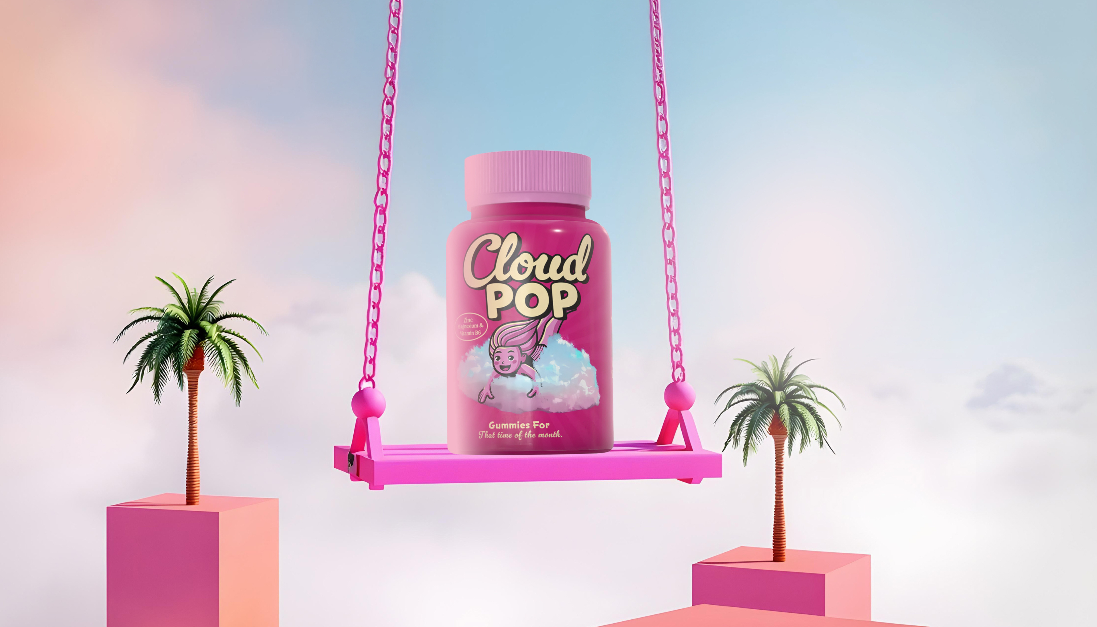
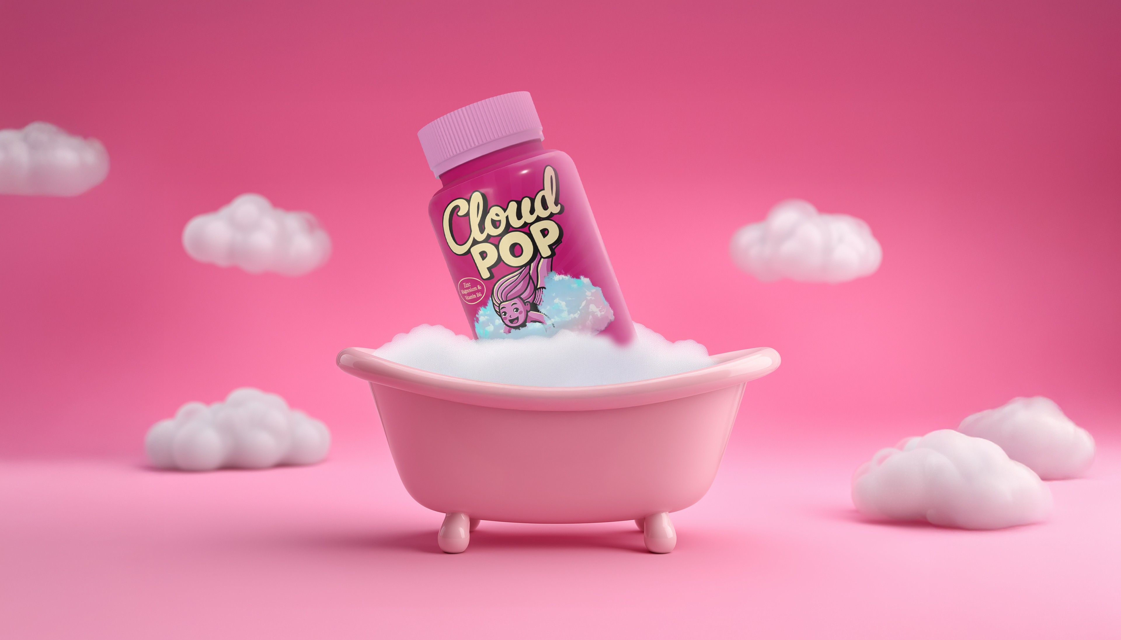
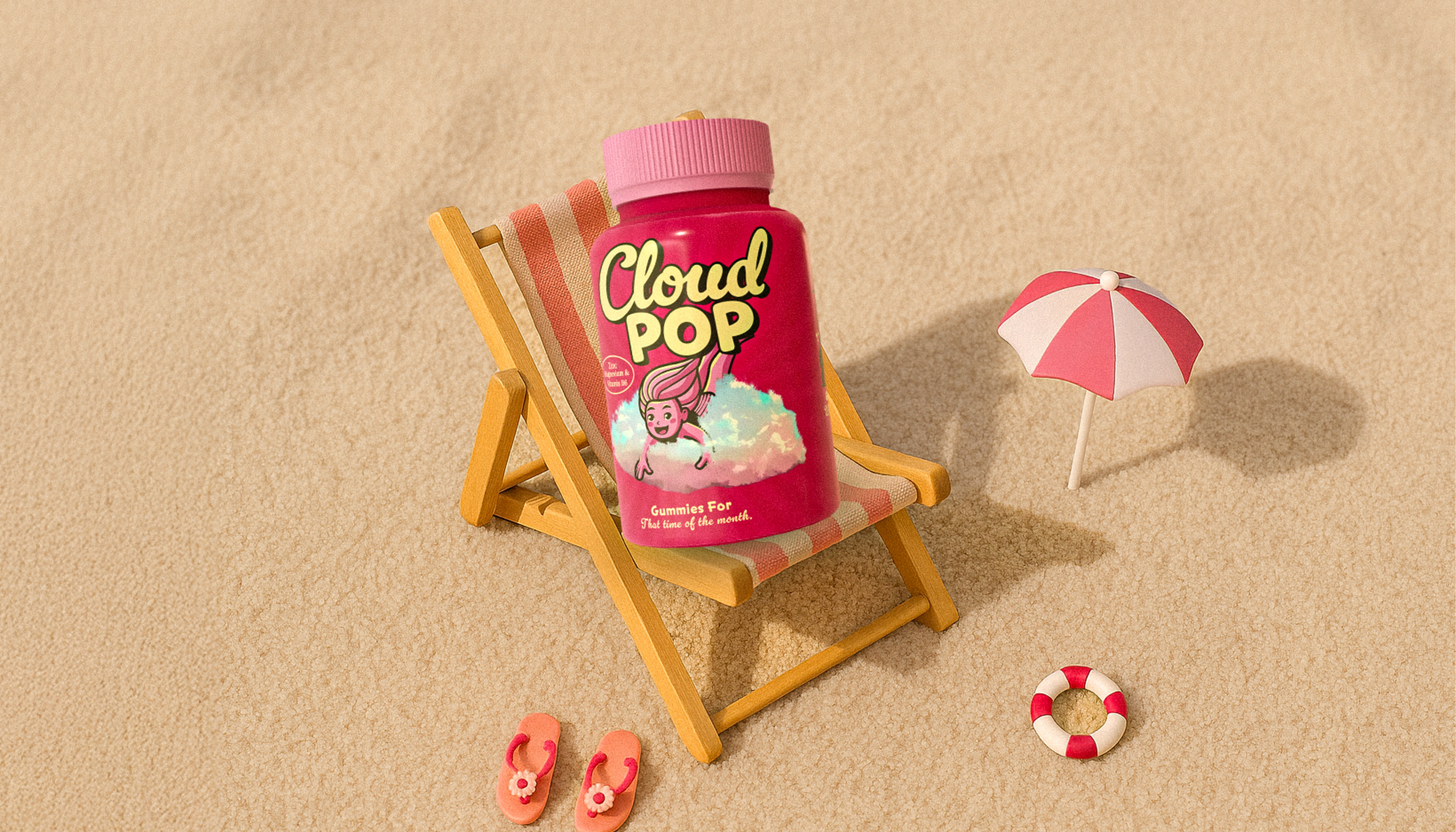
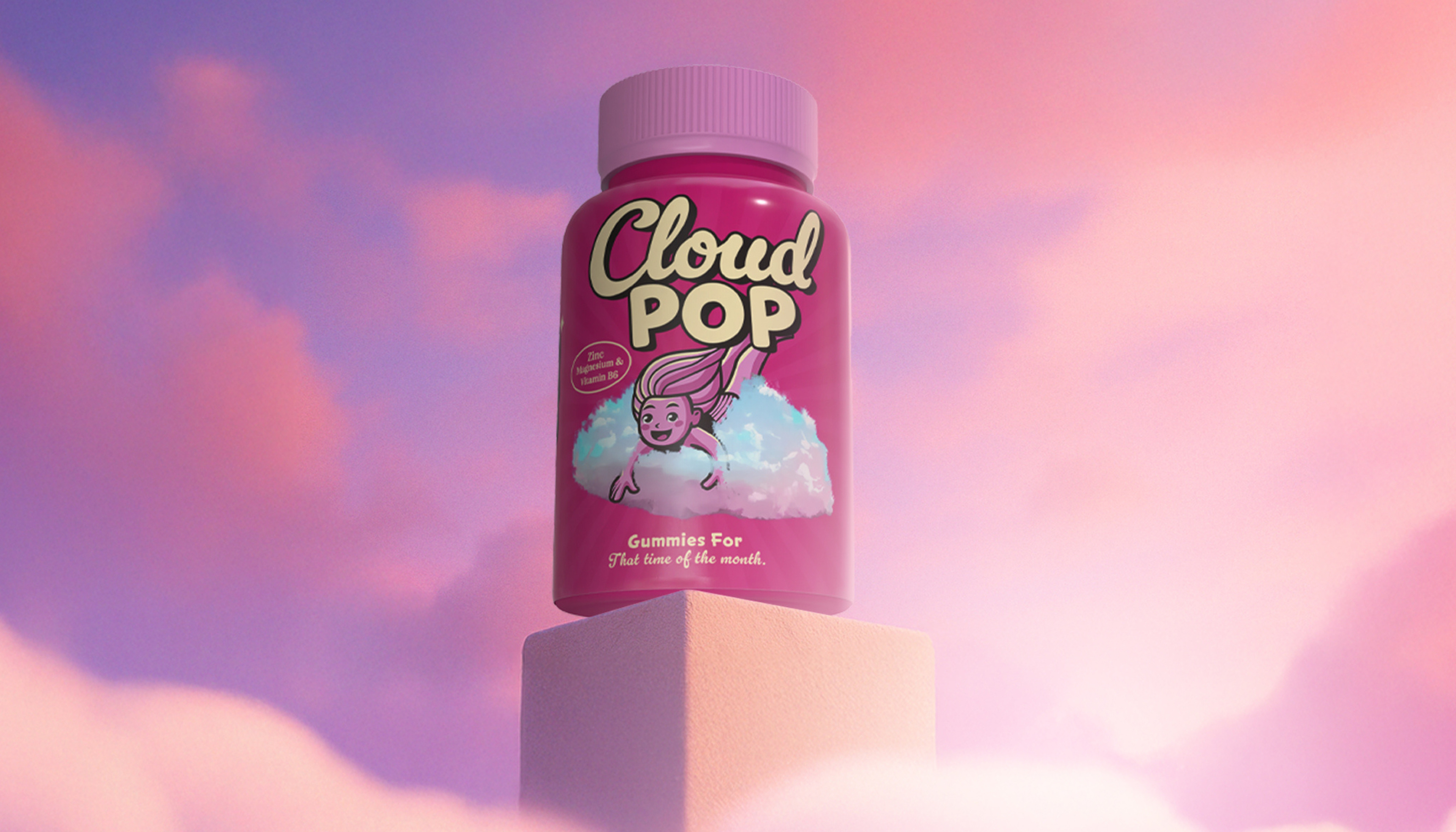
CloudPop is a packaging and branding project for a wellness brand focused on creating fun, approachable period care through flavorful gummy supplements. The goal was to design a bold and comforting identity that helps normalize conversations around menstruation while standing out in the saturated health and wellness space.
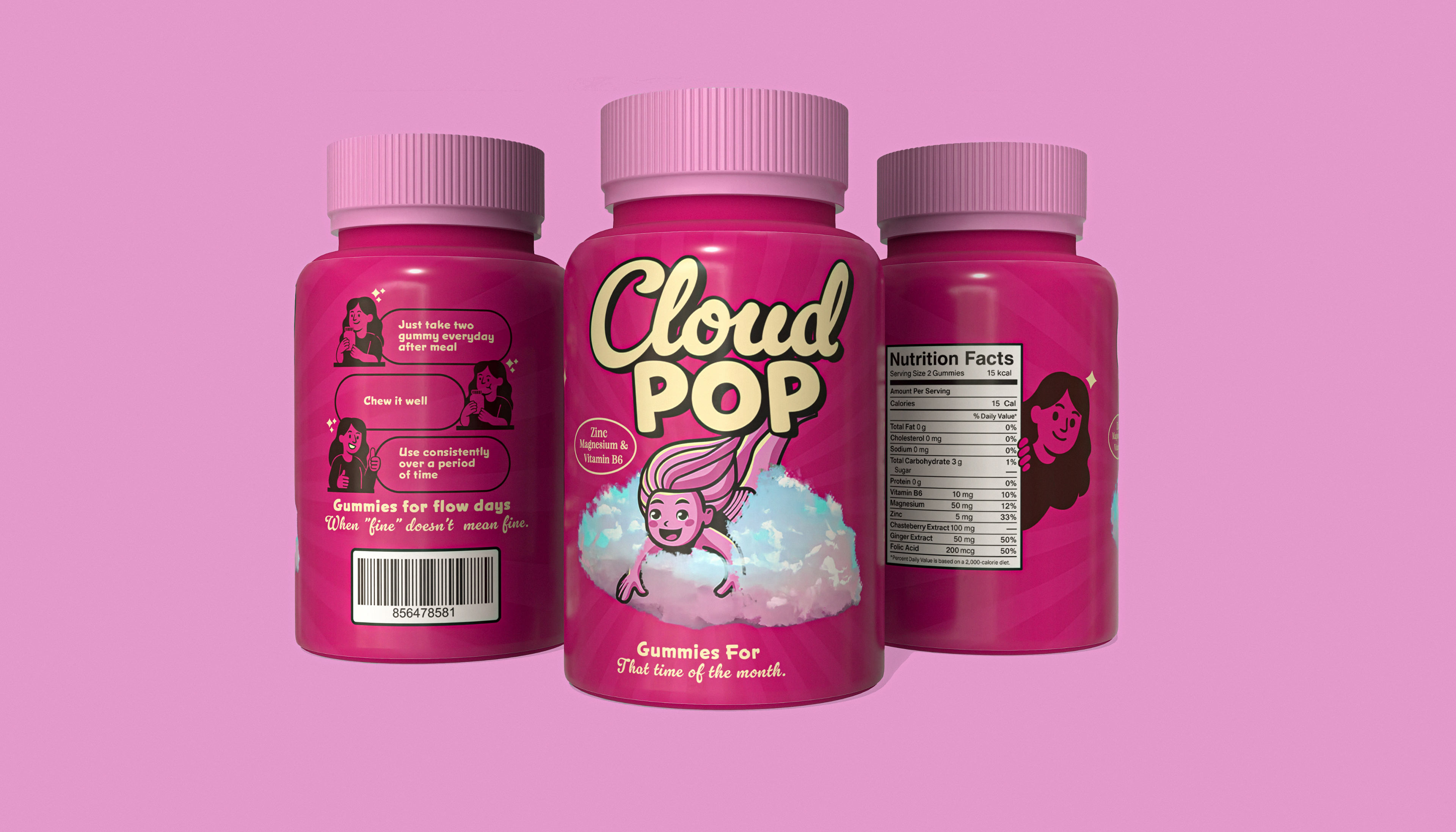
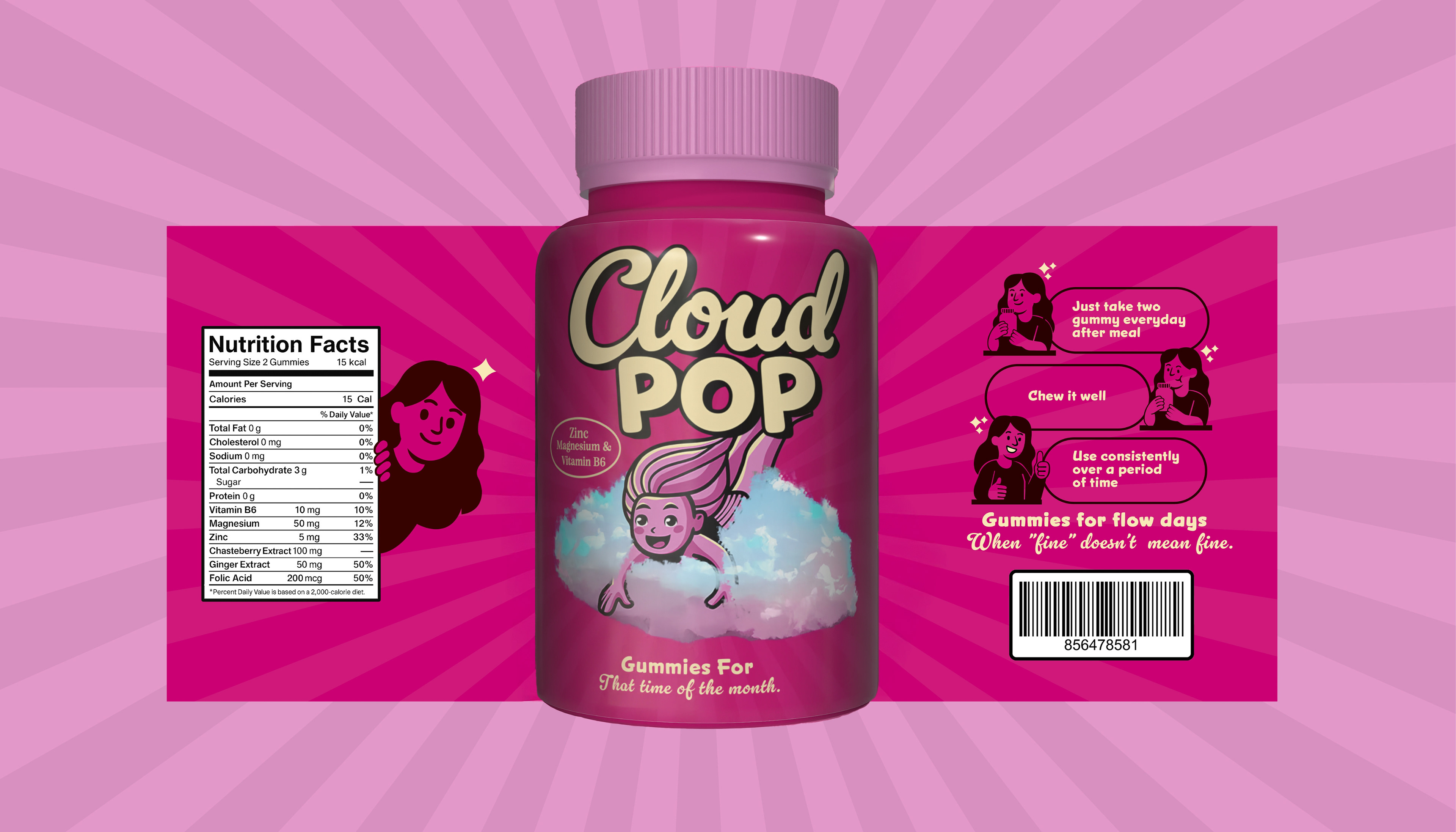
The project includes a logo design, color palette, custom illustrations, and packaging design that embody the brand’s playful and empowering tone. With its vibrant magenta hues, dynamic cloud visuals, and comic-inspired instruction panels, CloudPop aims to make wellness feel friendly, not clinical. The bottle design is clean, shelf-ready, and optimized for both retail and DTC audiences.
Beyond packaging, the design system extends into marketing content and storytelling elements that speak to a Gen Z and Millennial audience. From the tagline “When fine doesn’t mean fine” to the flying mascot, every detail was crafted to offer both emotional support and visual delight.
Year: 2025
Client: CloudPop
Scope: Brand Identity Design, Packaging Design, Illustration, Product Branding
Client: CloudPop
Scope: Brand Identity Design, Packaging Design, Illustration, Product Branding


Year: 2025
Client: CloudPop
Scope: Brand Identity · Packaging Design · Illustration · Product Branding
Designer: Udbhav Midha
Client: CloudPop
Scope: Brand Identity · Packaging Design · Illustration · Product Branding
Designer: Udbhav Midha
💌 Let’s create bold, meaningful brands together.
Got a product that deserves packaging with personality?
Got a product that deserves packaging with personality?
Send me a message or reach out at udbhav.midha@gmail.com